Accessible Beige SW 7036: Color Pairings, Design Tips, and a Fresh Take
What Accessible Beige teaches about accessibility
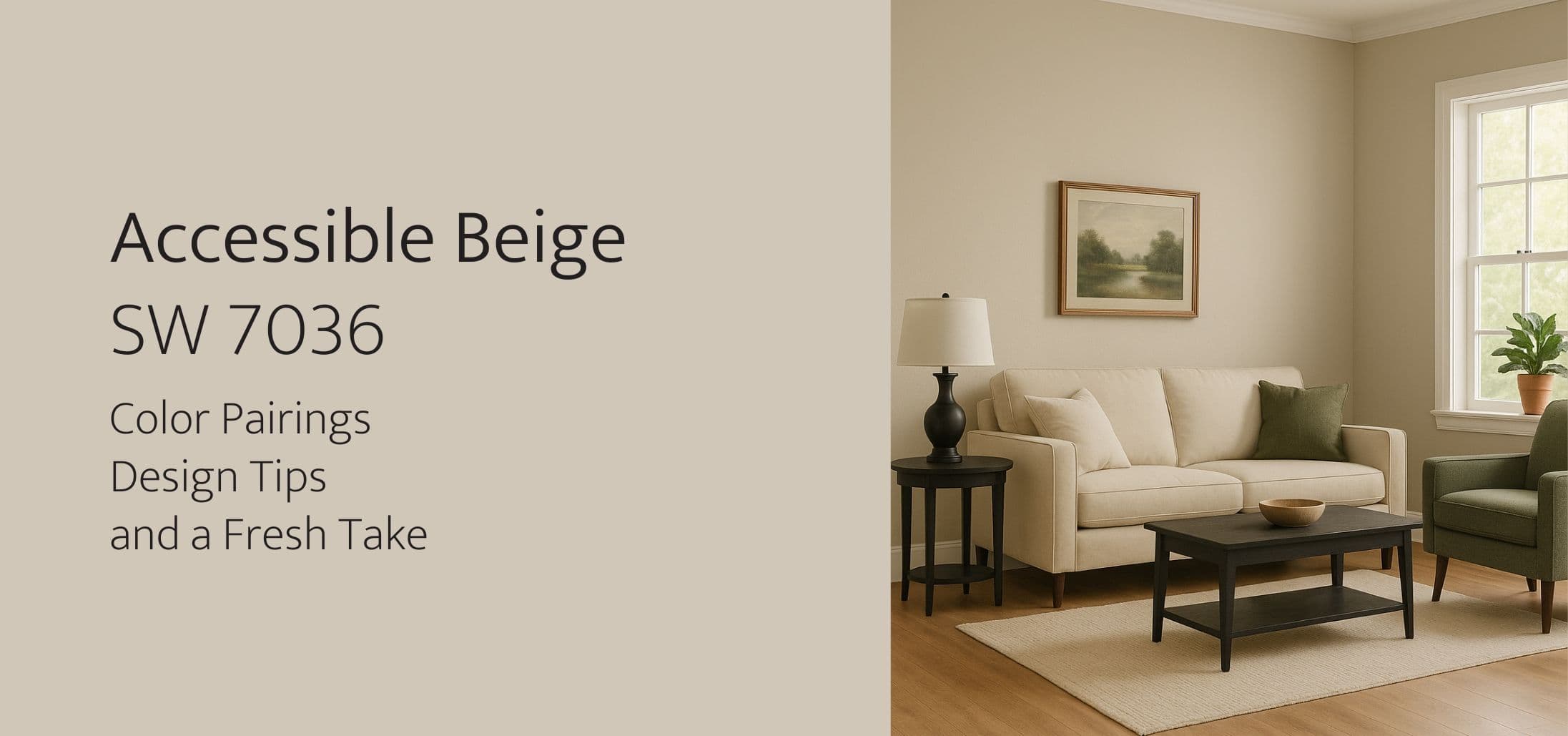
If you have been exploring paint colors for your home, you have probably come across Sherwin Williams Accessible Beige (SW 7036). This neutral tone shows up again and again in mood boards, home tours, and designer recommendations, and for good reason.
But beyond its appeal in interiors, the name itself, "Accessible Beige," offers an opportunity to think about accessibility in all forms of design, including digital. We will explore that idea a little later. First, let’s dive into everything you need to know about this timeless color.
What is Sherwin Williams Accessible Beige? (SW 7036)
Accessible Beige is a sophisticated, versatile neutral that sits somewhere between beige and greige (gray plus beige).
Is Accessible Beige warm or cool?
It leans warm, with subtle gray undertones. This balance helps it feel soft and inviting, rather than yellow or overly warm like traditional beige tones.
What color is Accessible Beige?
It is a muted, creamy beige with a slightly earthy quality. In natural light, it can read as a warm greige. Under artificial lighting, its warmth becomes a little more pronounced.
What Colors Go With Accessible Beige?
One reason for Accessible Beige’s popularity is how well it works with other colors.
What black goes well with Accessible Beige?
Look for soft blacks or charcoal grays, such as:
- Sherwin Williams Iron Ore (SW 7069)
- Sherwin Williams Tricorn Black (SW 6258)
These deepen the contrast while keeping the look elegant, great for door trims, window frames, or accent furniture.
Other colors that go with Accessible Beige:
- Soft whites: Alabaster (SW 7008), Pure White (SW 7005)
- Greens: Evergreen Fog (SW 9130), Sea Salt (SW 6204)
- Blues: Hale Navy (HC-154), Smoky Blue (SW 7604)
- Warm earth tones: Terra Cotta, soft blush, muted clay
It is flexible enough to pair with both cool and warm palettes, making it ideal for transitional spaces.
Accessible Beige in Design and Why "Accessible" Matters
The name Accessible Beige was coined for its versatility. It is a neutral that works across many lighting conditions, styles, and environments. In short, it is accessible to more spaces and tastes than many traditional beige tones.
But the word "accessible" carries another meaning that is just as important when we think about design in a broader sense.
In both interior and web design, accessibility means making spaces usable and welcoming for as many people as possible.
In physical spaces, that might mean choosing paint colors that provide enough contrast for people with visual impairments or ensuring enough light for aging eyes.
What About Web Accessibility?
Just as we think carefully about making our homes more comfortable and welcoming, it is worth considering how we design our digital spaces too.
Everything we post online, whether it is images, documents, written content, or code, should be accessible to everyone, including people with disabilities. Whether you run a business or simply use the internet for personal projects, this is something to keep in mind.
To make your website more accessible, focus on a few simple things:
- Use clear, easy-to-read text
- Organize content with a logical structure (such as proper headings and labels)
- Make sure your website works with screen readers
- Keep layouts clean and avoid overwhelming visitors with too much at once
- Ensure that people can navigate with just a keyboard, since not everyone uses a mouse
In short, just like choosing paint colors that make a room feel comfortable and usable, your website should feel just as welcoming and easy to use for everyone who visits.
If you want to explore this further, here is a helpful guide to get started: How to create accessible design for everyone.
Conclusion
Whether you are choosing Accessible Beige SW 7036 for your living room walls or selecting color palettes for your website, the goal is the same. Create spaces that are beautiful, welcoming, and usable for everyone.
If you care about good design in your home, why not extend that mindset to your digital spaces as well? A few small changes can make your website more accessible and more enjoyable for all of your visitors.
Get started
Ready to improve your accessibility?
Get a free compliance assessment and see how Wallyax can help your team meet WCAG and EAA requirements.