Ever tapped a button and nothing happened because you didn’t hit the exact right spot? For many, that’s every day online.
Over 1.3 billion people around the world live with some form of disability. That's 1 in 6 of us. As designers, we are shaping experiences for them too, not just for an abled user. Every choice we make around layout, color, typography, and interaction affects how someone navigates, understands, or experiences our product.
Accessibility in UX design means creating interfaces that are usable, readable, and flexible for everyone. It’s not just about checking compliance boxes. Whether you are creating a mobile app, dashboard, marketing site, or design system, making your designs accessible helps you build things that are easier to use and easier to understand.
For example, a user with low vision might struggle to read small text or distinguish low-contrast colors. Someone using a screen magnifier might miss alerts placed far from their interaction point.
In this guide, we will walk through some of the best practices to implement accessibility in your UI/UX designs. You'll also find real-world accessibility design examples, a practical a11y checklist, and free tools to test and improve your work.
1. Use Color Contrast That Works for Everyone
Colors are expressive. They convey emotion, organize information, and guide user focus. But when contrast is too low, it becomes a barrier, especially for users with low vision, color blindness, or anyone in a challenging environment like direct sunlight.
According to WCAG 2.1 Guideline 1.4.3: Contrast (Minimum), text should maintain a contrast ratio of at least 4.5:1 against the background. For larger text, the minimum is 3:1.
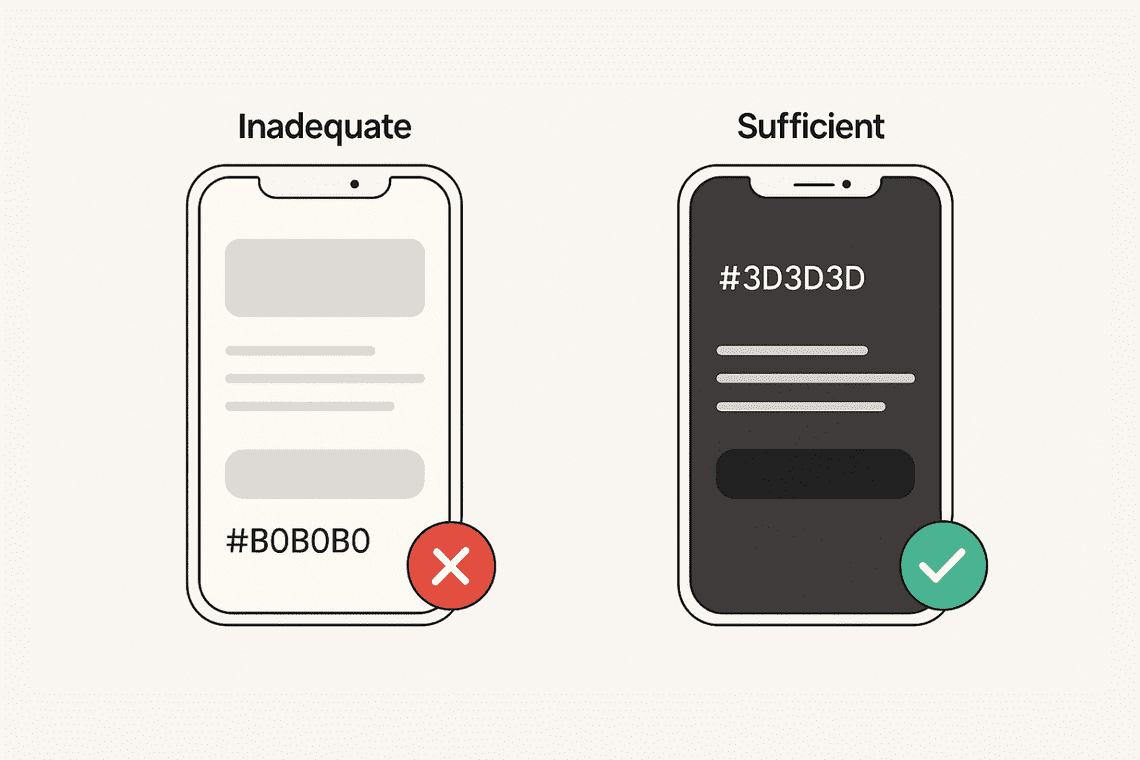
Real-world example of accessibility in UI/UX design
Imagine a mobile UI with light gray text (#B0B0B0) on a white background. In perfect lighting conditions, it may look minimal and modern. But for users with reduced contrast sensitivity, it becomes a guessing game. Changing the text to a darker tone like #3D3D3D increases legibility while keeping the aesthetic clean.
This applies not just to text but also to icons, form fields, input borders, and any visual element that carries meaning. High-contrast design supports both accessibility in graphic design and clear visual hierarchy.
UI/UX accessibility checklist to follow
- Does body text have enough contrast against its background?
- Are placeholder texts, form inputs, and icons also readable?
- Are interactive elements distinguishable in both normal and focus states?
You can start by using online contrast ratio checker. If you want a quicker way to spot and fix issues across the whole design, our Figma Accessibility Checker and Adobe Express add-on can help.
2. Improve Line Spacing and Text Layout for Readability
Readable spacing isn't just about aesthetics. It directly affects how users perceive and process content. For users with dyslexia, ADHD, or cognitive challenges, crowded layouts and tight text blocks make reading harder.
WCAG 2.1 Guideline 1.4.12: Text Spacing recommends designs support user-defined spacing settings without breaking the layout.
- Line height (line spacing) of at least 1.5 times the font size
- Paragraph spacing of at least 2 times the font size
- Letter spacing of at least 0.12 times the font size
- Word spacing of at least 0.16 times the font size
This doesn’t mean your UI/UX design needs to start with these values, but it must accommodate them without breaking the layout. In practice, generous spacing improves readability and supports users who rely on custom styles or assistive technologies.
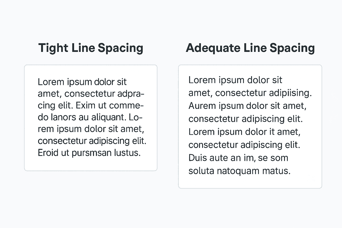
Real-world example of accessibility in UI/UX design
Imagine a block of text with minimal line height and no paragraph separation. Even fluent readers would find it dense. Increasing line height to 1.5x and adding paragraph spacing makes content easier to scan for everyone, not just those with disabilities.
UI/UX accessibility checklist to follow
- Is line height at least 1.5 times the font size?
- Are paragraphs clearly spaced and organized?
- Can your layout handle increased spacing without layout issues?
- Is the reading experience smooth on mobile and desktop?
Try increasing line and paragraph spacing manually to see how your layout holds up. You can also use Figma Accessibility Checker and Adobe Express add-on to easily catch spacing problems early.
3. Make Buttons and Interaction Targets Easy to Use
Small or crowded buttons can be difficult to tap, especially for users with motor impairments or anyone using a touchscreen. Accessible interaction targets help everyone complete tasks with less effort.
WCAG 2.1 Guideline 2.5.5: Target Size (Enhanced) advises that interactive elements be at least 44 by 44 pixels.
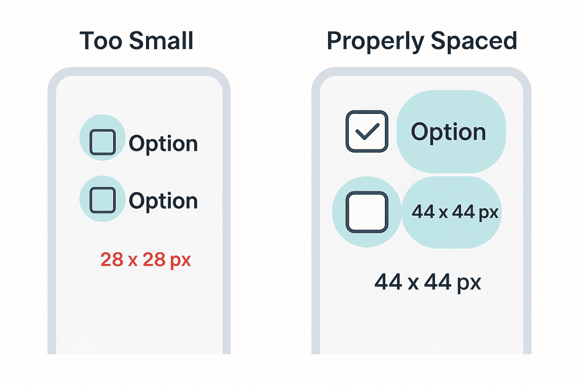
Real-world example of accessibility in UI/UX design
Imagine a form with a row of small circular checkboxes. On a desktop, they might work fine. But on a mobile device or for someone with limited fine motor control, tapping those targets becomes difficult. Increasing the size of each checkbox and adding padding between them creates a much more usable, accessible design without compromising layout.
This principle is especially important for icon buttons, close icons, toggles, and menu items.
UI/UX accessibility checklist to follow
- Are buttons and interactive items at least 44 x 44 pixels?
- Is there enough space between them to avoid accidental taps?
- Do interactive elements have clear visual cues like borders or hover states?
- Are icon buttons supported by text labels or accessible tooltips?
Try tapping through your design on a phone or tablet to see if any buttons feel too small or too close together. If you're working with lots of interactive elements, our Chrome Extension and Figma plugin can help you quickly spot and fix areas that need more breathing room.
4. Keep Layouts Clean and Understandable
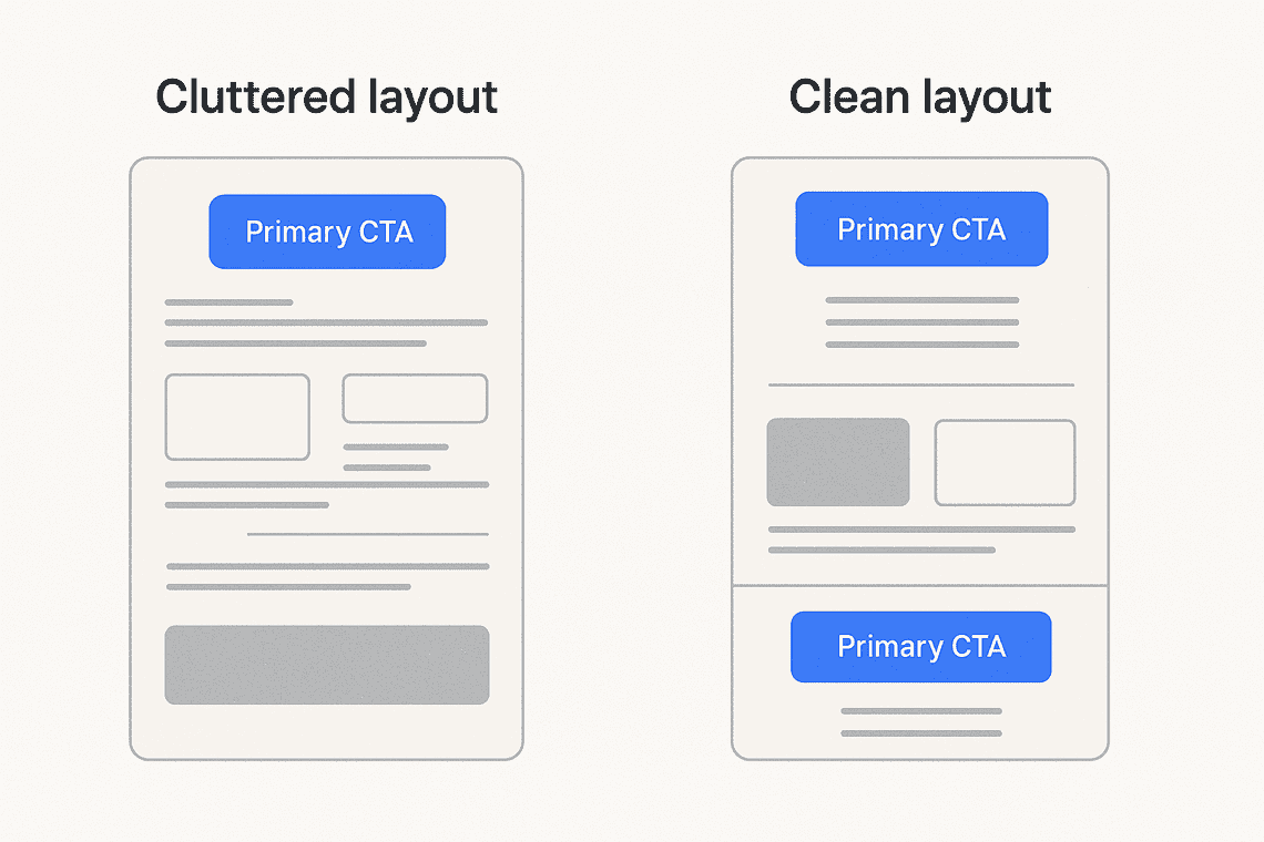
Clarity in layout is essential for users with cognitive disabilities or attention challenges. A clean, consistent interface helps people stay focused and understand what to do next.
WCAG 2.1 Guideline 3.2.3 and 3.2.4 emphasize consistent navigation and identification across your product.
Real-world example of accessibility in UI/UX design
Imagine an interface where a primary CTA button shifts position on different pages, or navigation changes order. This inconsistency forces users to re-learn the UI every time, which reduces usability for all users, especially those with cognitive impairments.
Clear layouts support better accessibility in UX design, especially for multi-step flows like onboarding, checkout, or dashboards.
UI/UX accessibility checklist to follow
- Is navigation consistent across pages?
- Do repeated elements behave the same in different contexts?
- Are visual groupings intuitive and easy to scan?
- Are section layouts predictable from screen to screen?
Step back and ask if your layout feels easy to follow at a glance. If you're reviewing multiple screens, our Figma plugin or VS Code Extension can help you spot inconsistencies more quickly.
5. Let Users Control Font Size
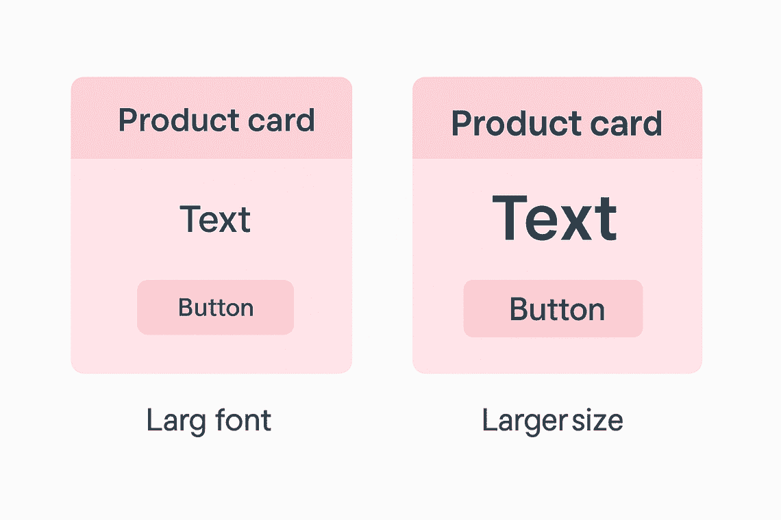
Many users rely on larger font sizes for comfort or visibility. Your layout needs to adapt without breaking.
WCAG 2.1 Guideline 1.4.4: Resize Text ensures that users can increase text size up to 200 percent without needing to scroll horizontally or losing content.
This is not just a code-level concern. Designers play a key role in ensuring that layouts and components can scale with font size without breaking or hiding content. If the UI/UX design does not support flexibility, users may lose access to important information.
Real-world example of accessibility in UI/UX design
Let’s say your product card has a fixed height. If a user increases font size, the text gets clipped or overflows. A more flexible design allows the card to expand naturally, preserving both function and readability.
This practice supports accessibility in UX design and ensures your layout works across a wide spectrum of user preferences.
UI/UX accessibility checklist to follow
- Does text scale properly up to 200 percent?
- Are components responsive to font size changes?
- Is layout preserved without introducing horizontal scrolling?
- Are font sizes defined in relative units like em or rem?
Try zooming in or adjusting font size to see if your layout holds up. Alternatively, you can use our Figma plugin to catch and fix scaling issues immediately. If you are into development, you can use our VS Code Extension for the same.
6. Use More Than Just Color to Communicate
Designs that rely only on color to convey meaning risk leaving many users behind. Users with color blindness, low vision, or screen readers often miss out when color is the only signal for something important.
WCAG 2.1 Guideline 1.4.1: Use of Color recommends that information should not depend solely on color.
Real-world example of accessibility in UI/UX design
Consider a form that marks errors using only red outlines. For users with red-green color blindness, these indicators may be invisible. Adding a warning icon or descriptive message alongside the color cue ensures everyone can understand the issue.
UI/UX accessibility checklist to follow
- Are errors or required fields marked with both color and text or icons?
- Do charts and infographics remain clear in grayscale?
- Are different states like hover or selected visually distinct in more than one way?
View your design in grayscale to check if meaning still comes through without color. If you’re working with complex visuals or charts, our Adobe Express add-on can help reinforce meaning with icons or labels.
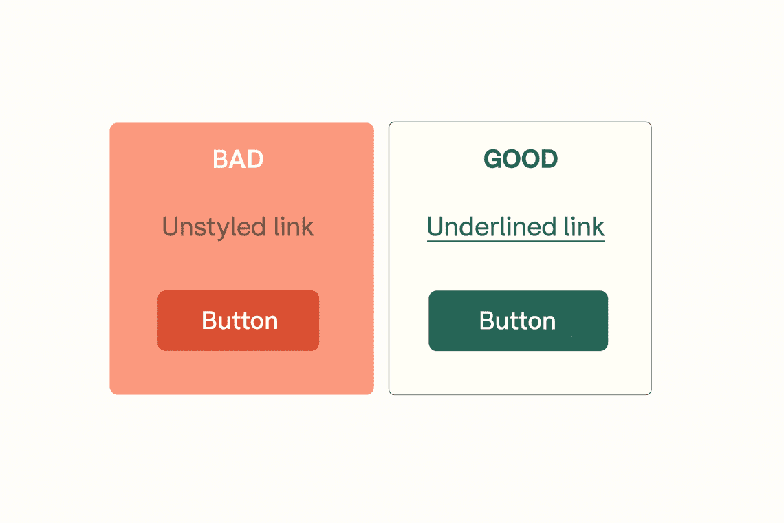
7. Make Links and Buttons Easy to Identify
Clickable elements like links and buttons should always be visually clear. If a user cannot tell what is interactive, they may miss it entirely or struggle to navigate.
WCAG 2.1 Guideline 1.4.1: Use of Color also applies here. Links must be distinguishable in more than just color alone.
Real-world example of accessibility in UI/UX design
Imagine a blog post where links are styled in a slightly darker shade of text without any underline. Many users, especially those with vision challenges or cognitive disabilities, won’t recognize these as links. Adding an underline or icon improves clarity and usability.
UI/UX accessibility checklist to follow
- Are links styled with more than just color, such as underlines or icons?
- Are buttons clearly labeled and easy to recognize?
- Do all interactive elements have clear hover and focus states?
- Is link text descriptive enough to be understood out of context?
Skim through your design and see if links stand out clearly, even without color. If you're not sure, our Figma Accessibility Checker can help you check and improve link visibility across the board.
8. Let Users Control Auto-Playing Content
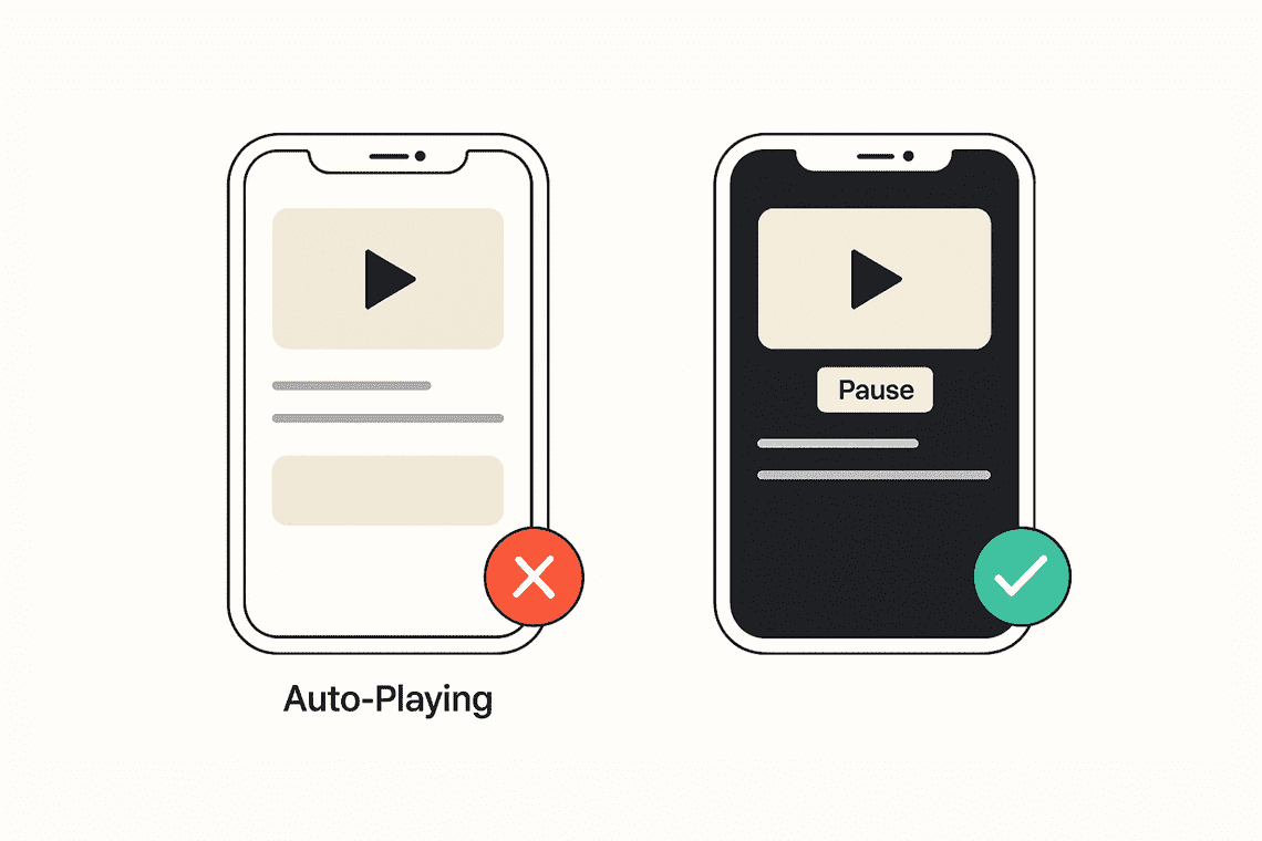
Auto-playing content can be disruptive. Videos, sliders, or animations that start automatically can confuse users, overload cognitive processing, or trigger motion sensitivity.
WCAG 2.1 Guideline 2.2.2: Pause, Stop, Hide requires that users be able to pause or stop any moving content that plays for more than five seconds.
Real-world example of accessibility in UI/UX design
A landing page includes an autoplaying video with background music. Users with ADHD or sensory sensitivities may find it distracting, and those using screen readers may struggle to focus. Adding a visible pause button and ensuring the video does not autoplay without consent makes the content far more inclusive.
UI/UX accessibility checklist to follow
- Do videos and carousels include controls to pause or stop playback?
- Are animations limited and used purposefully?
- Can users disable motion if needed?
- Is there an option to hide moving content entirely?
Run through your prototype and see what starts playing automatically. If it catches you off guard, chances are it will for others too. You can use our Chrome Extension to quickly flag any autoplay elements that don’t offer controls.
9. Design Responsive Layouts That Adapt Smoothly
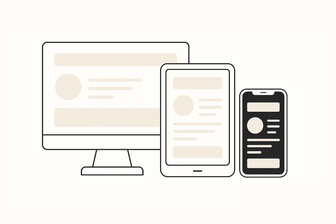
Accessibility includes more than just color or contrast. It also means ensuring that your layouts adapt well to different devices, screen sizes, and zoom levels. Responsive design helps users with magnifiers, screen readers, or orientation preferences access your content without issues.
WCAG 2.1 Guideline 1.4.10: Reflow states that content must work at 320 pixels wide without requiring horizontal scrolling or hiding information.
Real-world example of accessibility in UI/UX design
Imagine a dashboard that looks great on desktop, but on mobile, the sidebar overlaps the content when zoomed. A flexible layout that reflows properly ensures that no user loses context or functionality when changing orientation or zooming in.
UI/UX accessibility checklist to follow
- Does your design hold up at smaller widths, like 320 pixels?
- Is content still usable when zoomed to 200 percent?
- Are key actions and content reachable in both portrait and landscape?
- Are headings, text, and controls scaling proportionally?
Resize your browser or rotate your screen to see how your layout responds. If you're working with many screens or components, our Figma Accessibility Checker helps test reflow without switching devices.
Conclusion: Good Design is Accessible Design
Accessibility in UX design is about creating experiences that work for everyone. From clear color contrast to responsive layouts, each step makes your product more usable, inclusive, and human-centered.
Making your designs accessible also improves SEO, usability, and performance across devices and conditions. It elevates your work in graphic design and strengthens the foundation of web design projects.
Use the WCAG 2.1 guidelines as your reference, but don’t stop there. Test your work regularly. Get feedback from real users. Make accessibility part of your process, not just a final polish.
Good design is accessible design. And accessible design is good for everyone.