How To Start Designing For Accessibility When Your Team Is New To It
When a team is new to accessibility, it can feel like a huge mountain to climb. But the truth is, accessibility starts with small, repeatable habits. You don’t need to know WCAG inside out or have a dedicated accessibility specialist to begin. You just need to understand why accessibility matters and how everyday design decisions shape real people’s experiences.
A great example of this is the recent Apple accessibility commercial “I'm Not Remarkable”. Its message is simple: accessibility isn’t about creating exceptional tools for “exceptional” people. It’s about making everyday technology work seamlessly for everyone. That mindset is exactly what new teams should adopt when taking their first steps into accessibility.
What Designing for Accessibility Really Means
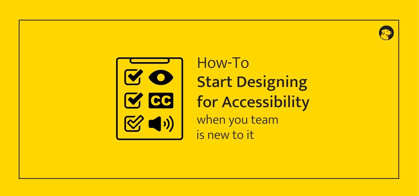
Designing for accessibility doesn’t require advanced expertise. It means making sure your product is understandable, operable and predictable for a wide range of users. This includes basics like:
- Writing clear, descriptive link text
- Keeping headings in a logical order
- Ensuring keyboard users can reach everything
- Avoiding color-only cues
- Adding clear form labels
- Using meaningful alt text
- Supporting zoom and readable spacing
These little changes dramatically improve the experience for screen reader users, keyboard-only users, low-vision users and anyone who benefits from clearer structure. If you want to understand the fundamentals in more detail, this guide is a helpful companion:
Impact on Real Users
When accessibility is new to your team, it helps to ground the work in the lived experiences of actual people. Users with disabilities aren’t edge cases. They are students, professionals, parents, creators and community members.
Consider just a few scenarios:
- A screen reader user trying to understand your layout without clear headings
- A user who is color blind unable to interpret color-coded categories
- A keyboard-only user getting stuck inside a modal
- A user with dyslexia struggling with dense paragraphs or tight line spacing
Even something small like zooming to 200 percent or navigating without a mouse can reveal exactly where your product becomes difficult. And much like the Apple accessibility commercial, it reminds us that accessibility is about making everyday tasks more equitable, not extraordinary. In the words of the ad itself, “I’m only remarkable cause everybody is” – a perfect reminder that inclusion should feel normal, not exceptional.
How To Spot Accessibility Issues Early
You don’t need training or expensive tools to identify common accessibility issues. Try these quick checks:
- Navigate your site using only the Tab key
- Turn on VoiceOver or NVDA and explore your homepage
- Zoom the page to 200 percent to check layout resilience
- Run a lightweight automated scan with your browser’s dev tools
- Look for vague links like “Learn more” or “Click here”
- Check if images missing alt text are actually meaningful
Publishing an accessibility statement early on is also a strong first step because it sets the tone for transparency and ongoing improvement. If you haven’t written one yet, use this guide:
Step-by-Step Fixes for New Teams
Here’s a simple, beginner-friendly workflow that gets your team aligned quickly.
Start with a tiny accessibility checklist
Keep it small and easy to remember:
- Color contrast meets minimum ratios
- Clear labels on every form field
- Logical headings
- Descriptive hyperlink text
- Visible focus indicators
- Buttons are real <button> elements, not styled divs
Use accessible components from the start
Modern frameworks offer accessible primitives you can build on. Avoid rebuilding basic UI components from scratch unless you’re confident in accessibility patterns.
Structure your content semantically
Use headings for hierarchy, lists for lists, labels for inputs. This helps assistive tech interpret your content accurately.
Run quick automated checks
Automated audits won’t catch everything, but they do surface the most common issues early, long before design debt piles up.
If you want an easy way to bring this into your workflow, Wally’s WAX Chrome Extension and WAX Linter for VS Code can flag accessibility problems right where you work, so your team fixes issues as they create them instead of scrambling later.
Add accessibility to your workflow
Make it part of design reviews, code reviews and QA checklists. Even five-minute checks go a long way.
For lightweight pre-launch checks, this guide helps:
Ready to Make Accessibility a Team Superpower?
If your team is just starting out and wants to build accessibility into your design and development process the right way, we can help. Book an accessibility consultation with Wally and we’ll train your team, set up an accessible workflow and help you build inclusive habits that scale. You don’t need expertise to begin. You just need the right guidance and a plan.